Css is constantly leveling up!
Css is constantly leveling up!


.webp?width=220&height=219&name=frame_96%20(1).webp)
We all know the CSS memes, and how backwards and confusing the technology is… If you still have this mindset, get ready to have your mind blown away, as CSS in the darkness of its cave, has been pumping iron and it "got gud".
No js, pure CSS Accordions & Toggles
When you imagine an accordion, you see the interactions of opening and closing sections and think the only way to do it is with js. Actually you can make a pretty decent accordion with just CSS. Here you use the :checked property and the sibling selector. We can show/hide and animate the accordion content just by toggling a simple radio button. A radio button will automatically close any other accordions if another one is opened. Neat!
Need to open multiple accordions at once? Just switch to a basic checkbox input instead. Using native input components and reducing js will definitely reduce page load times.
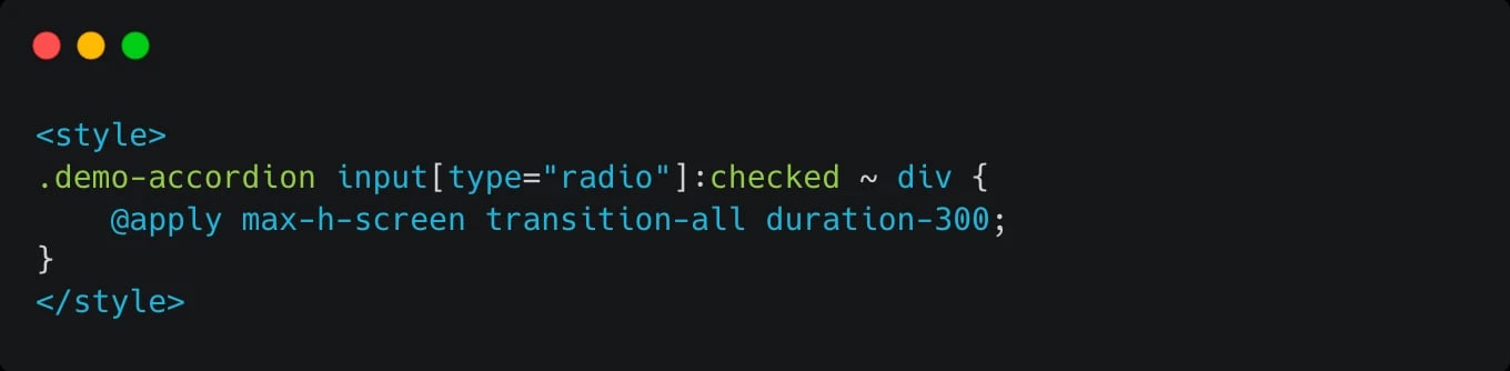
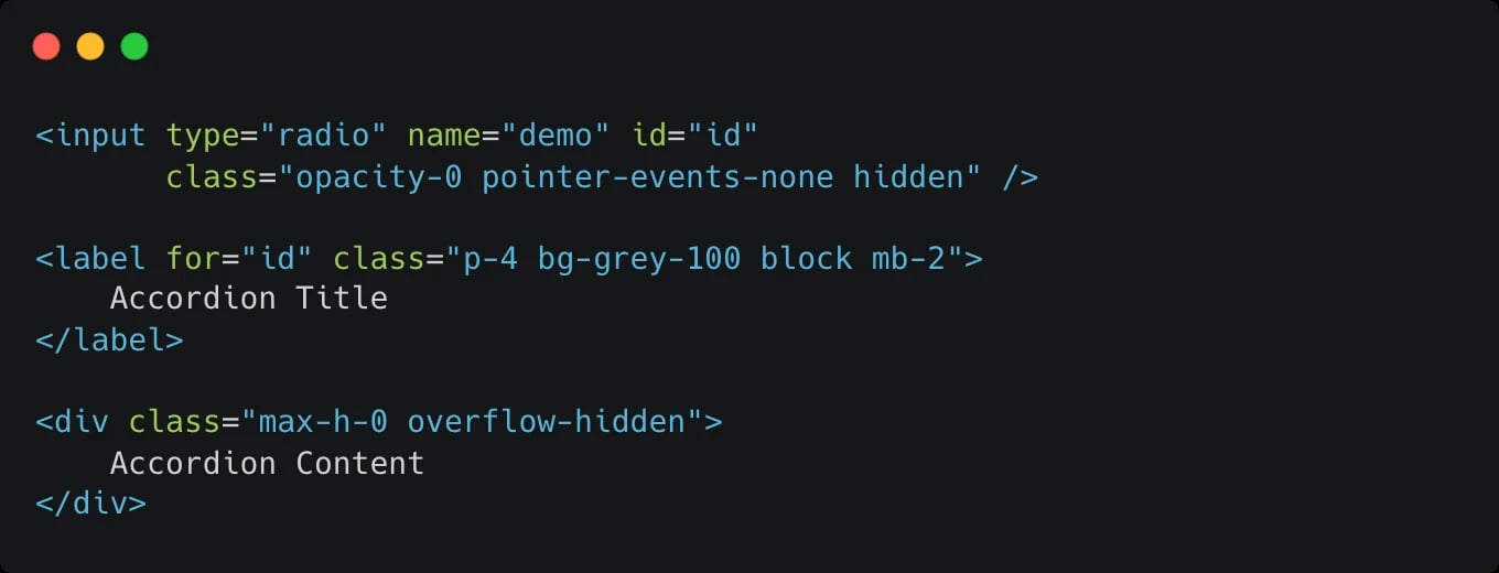
We use this method on all our FAQ's - view a demo here
CSS Line Clamping for Text Overflow Control
Whenever we need to truncate some longer text, so it fits in a card, the go to method was either chopping of text after a certain amount of characters, or setting a height and overflow: hidden to hide the rest. Neither of these options were properly responsive. Until now.
CSS has line-clamp properties that allow you to set the amount of lines you want to see. No more counting characters or weird height calculations. The text is cropped and even gets an ellipsis (...) at the end of the test.
If you use TailwindCSS it’s built into its core (from version 3.3).
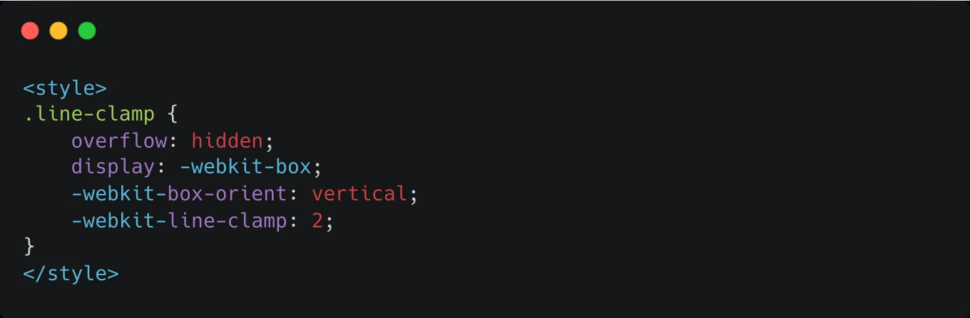
By controlling overflow, you ensure that users get a taste of the content, encouraging them to click and read more.
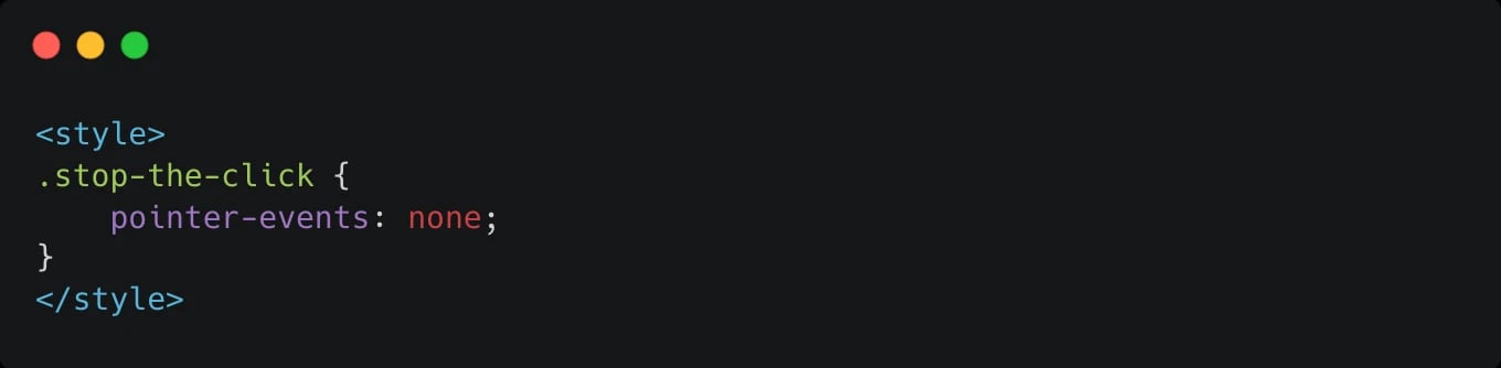
CSS can disable every element in the DOM. This is pointer-events
This property isn’t that new. Did you know that you could add a css property - pointer-events: none to an element and your cursor (including tabbing, focus) will completely ignore the element? As if the element didn’t exist.
How to use this? As an alternative to loading states. Let’s say you need to wait for a response from your API and want to disable a button so the user doesn’t mash it a hundred times. Sure you can use the disable property, or pointer-events.
You can also use it to overlay something over your entire website, like a fancy gradient or noise effect, and set the pointer-events to none, and the user won’t be able to interact with the element.
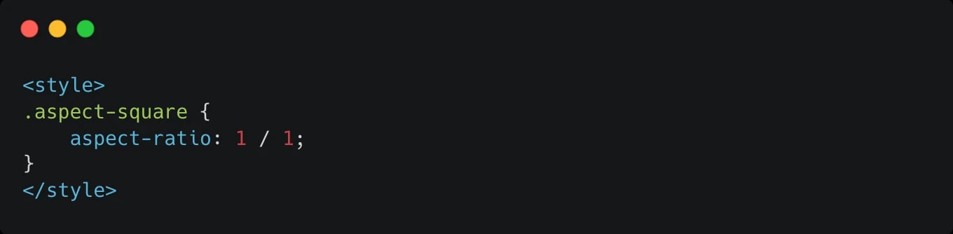
CSS Aspect Ratio for Maintaining Size Ratios of Media
Keep your images and videos looking perfect, regardless of the device. CSS aspect ratio ensures that your media maintains its intended size and proportion, enhancing visual consistency across platforms.
This feature is crucial for designers and content creators who want their work to look its best on any screen. Whether it's a portfolio, online store, or blog, maintaining the correct aspect ratio improves the overall aesthetics and usability of your website.
We use aspect ratio a lot on this website and for our clients. It has really saved us a bunch of times!
CSS Container Queries for Responsive Design. Level up your responsive design
Media Queries are nice, and they help us create mobile, tablet and desktop versions of our website. But sometimes you want to adapt something based on the width of the parent container, not the entire screen. This is what Container Queries solves. It's a rather new function, so watch out for browser compatibility, but it lets you create media queries inside a container. If you know how to use media queries, using container queries is pretty much the same idea.
No more props for determining component sizes, or versions. You can use css container queries to change the look of your component based on the width of its parent. This mean less duplicated code and components, which always equals less tech debt and a more performant design.
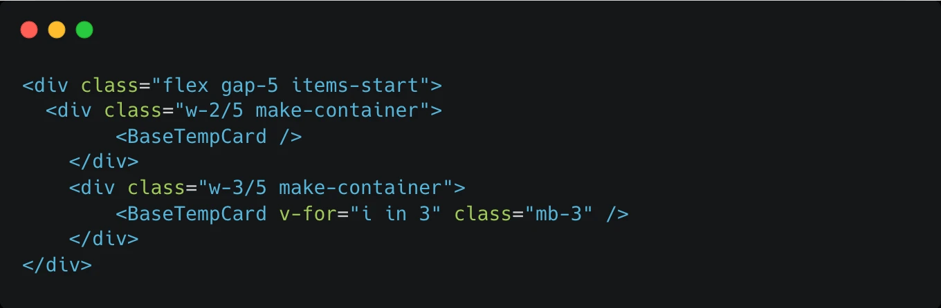
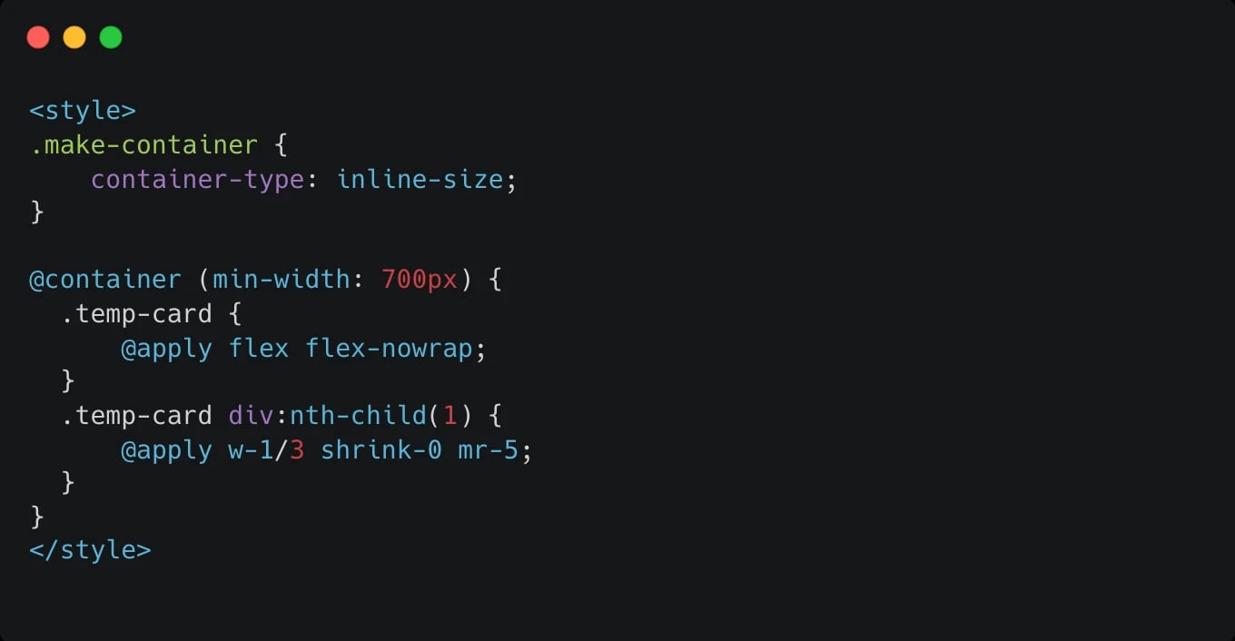
@container with a matching min width is the key to using container queries.
CSS Scroll() - Stop watching the scrollbar with js
This problem is as old as jQuery. Listening to the scrollbar to start an animation or show a progress bar of how much you have read of an article. This used to mean a js listener or watcher that would constantly monitor if the scroll has changed and fired functions that reacted to it.
Scroll() in CSS does that natively.
You don’t need to listen for this anymore. The best use case is to match scroll() with css animations and create parallax effects, progress bars based on scroll etc…
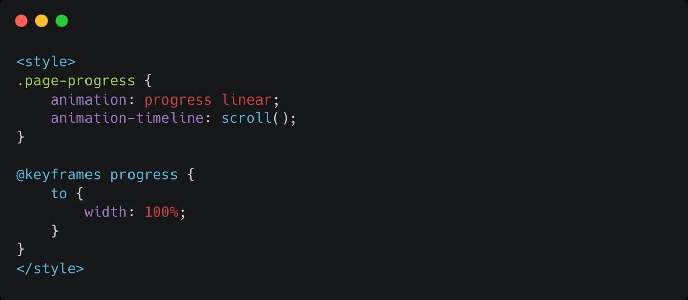
If you noticed the green progress bar on this article, yup, you guessed it, its CSS scroll() with a simple animation. Browser support is a little iffy, but it gracefully degrades and doesn't cause harm. A 10/10 for me!
But that’s not all! We also get View() which works when an element enters the viewport. CSS now handles intersectionObservers for us. Though this is still experimental, and has low browser support, it will mean that viewport animations can be done solely in pure CSS.
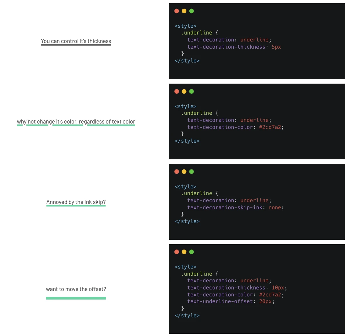
text-decoration:none is just the beginning?
Turns out text-decoration is a shorthand for a whole range of underline designs. You can do things like change the underline color in CSS, but also change its underline thickness, offset and even if it should skip the ink in letters like y or g.
This is ancient technology, maybe you already knew these properties, but often there are hidden gems in CSS that are overlooked. I definitely missed this even though I’ve been making UI’s for over 10 years!
Snap scrolling for sliders
It's now easier to manipulate scrollbars with CSS. The new snap properties allow you to move the scroll a little bit and CSS will move the entire slide to snap in the center. This effect using js would normally mean a lot of calculations and then recalculating if someone resized their window. If you are a tailwind user the snap-scroll is already built in and really easy to use.
We use snap scroll on this website in our sliders. Js just moves the slide a tiny bit, and the rest is done by css. Pretty nifty. Tailwind has a really good doc about css snap scroll so feel free to read it.
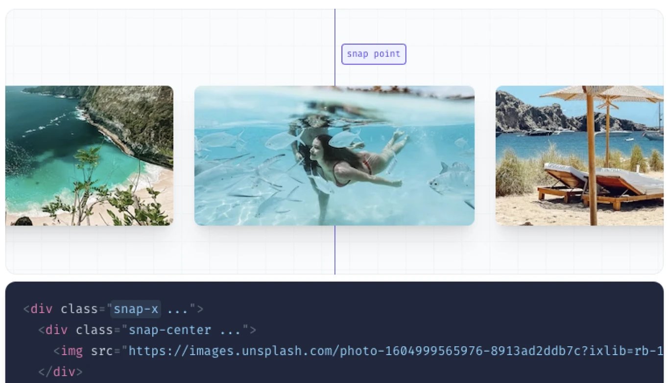
Image - @tailwindcss